I used to opt the vehicles for my daily commute according to the morning mood and daily schedule. I wrote about my BMTC bus travelling experience here. Since last month, I am going through a busy schedule. Starting from 6 am to badminton, 11 am to the office, 7 pm language classes. So I started using VOGO Daily. There are VOGO stations where you have to pick up the bike and drop in the other station.
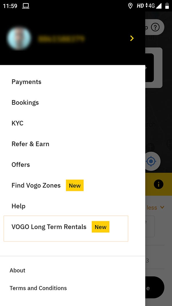
One day I have noticed that they have introduced the Longterm Rentals as a NAVIGATION on the Hamburger menu. I was curious and tapped. There was a form like this.

I filled up the form (I was not expecting a form there). I got a call back from their Support team.
Once I came back to Bengaluru after my vacation, I went to the Vogo station to take the bike for daily rental. I completely forgot about long term rentals. One person at the station asked me whether am interested in renting the bike. He asked me for my details. I was wondering, why do they need it? They already have my details with them. He was Whatsapping these to someone. It took almost 15 minutes to receive a payment link SMS. I paid through that link. I didn’t get any confirmation of long term rentals. I took the bike which was suggested by that person by scanning the QR code.
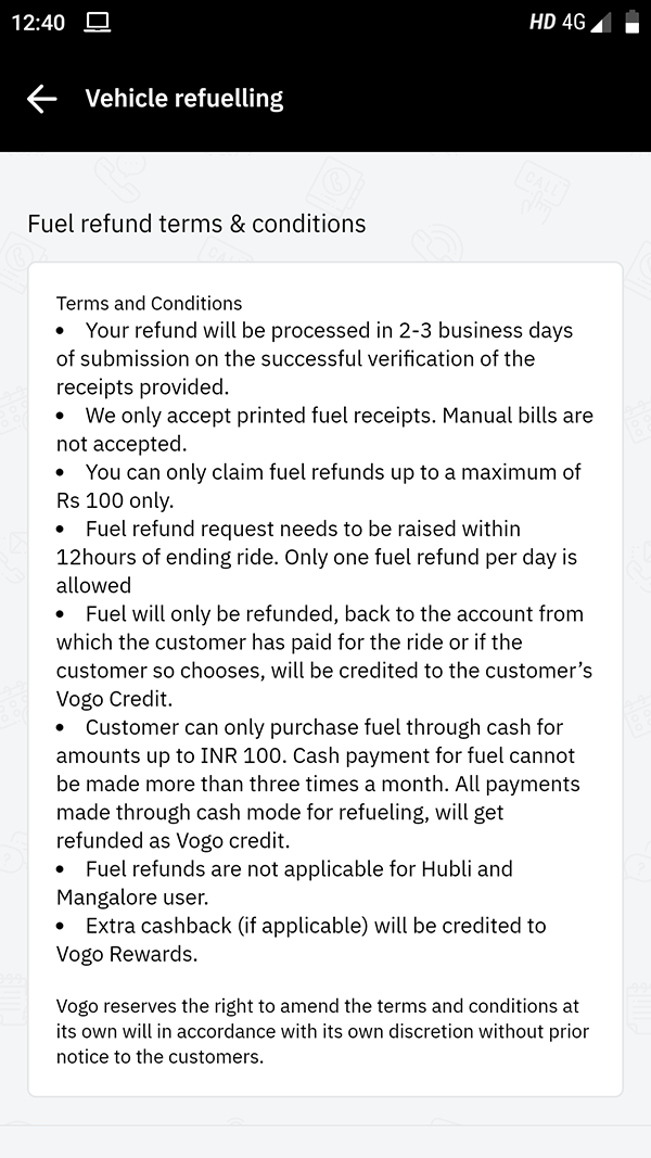
I used to get SMS of their fuel policy updates and others. I was thinking about my fuel reimbursements. Later I realised there is no fuel reimbursement for long term rentals. It’s only for Daily rentals. That’s fine. But what stuck with me was, nobody explained these terms and conditions. I checked in the HELP session too.
After 13 days,( I rented for 15 days) I have got a call and SMS from Vogo regarding the renewals. I called the customer care and requested for renewals. They sent a payment link through SMS. I clicked and completed the payment. Then what? I was expecting at least an SMS to say that my bike rent renewal is done. I got nothing. I have got one SMS from my bank that my cash got debited.
Whatever I have written above are NOT complaints. I am gonna explain, as a user how I was expecting the Onboarding experience for Bike long term rental.
They could have been introduced a new tab in the bottom. Like Daily and Long term.
Tap on the Long term -> First time user, shows the terms and conditions (Close / skip )-> Select the duration (15 days / 30 days) -> First time user, Confirm the personal details (they have already my licence copy + phone number) -> Select the payment mode -> finish the transaction -> Suggest the well conditioned bikes -> Scan the QR code-> Start riding.

Simple. It will take hardly 2 minutes.
Instead of the ride time (see the pic below), show the remaining days. So the user will be aware of the renewal date

On the renewal date -> prompt for payment -> show the payment methods -> renew it ->Get the confirmation of the renewal
It’s a simple UX design approach. We can think of many approaches like this. Let me know your thoughts.
